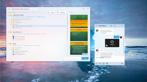
The dialog isn't a minature version of File Explorer anymore. It now shows you recent folders you have accessed and a glimpse of what's inside for quicker selection. Preview panel is turned on by default. In case user needs to browse deeper, they can always expand their selection on File Explorer, which basically means back to the legacy view.
Choosing to explore a folder deeper and choosing to open the whole folder also has gotten less ambigous for users. I replaced "Cancel" button by "Browse in File Explorer", so that the "Open" button now only has one purpose. Besides of showing recent destinations, the redesigned dialog also features a "Shared with me" section. You can think of it as the Airdrop section in macOS Finder.
You may also notice some visual differences compared to current WinUI components design. There will be more, however in this post I will draw your attention to search bar and buttons.
Search bar and buttons are now complemented with shadow effects and thin outline for adherence to Fluent Design principles and most importantly, to increase visual contrast.
Personally, I'm not in favor of sacrificing accessibility for a "cleaner" design (example shown above). Apart from the white splash of colors which is a huge pain to people's eyes, using only drop shadow is not enough to differentiate components and its background. It even can help blend the elements together which is impractical. IMO this "cleaner" design is more trendy than practical. I mean adding an outline is way easier.
PS: The canvas size is 1366x768, buttons are as compact as possible so small margins and padding etc. Not suitable for touch obviously.
Wallpaper in design named "Going with the floe" by Microsoft, curated by Michael Gillett https://wallpaperhub.app/wallpapers/7435
Questions for post-discussion:
1. Should the preview panel be turned on by default?
2. Is it necessary to provide a "Recent files" section?


No comments:
Post a Comment