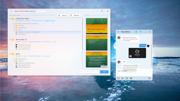
Quick reference is essential to productivity in the modern age. Yet, most new tab pages (NTP) didn't do a really good job of supporting it.

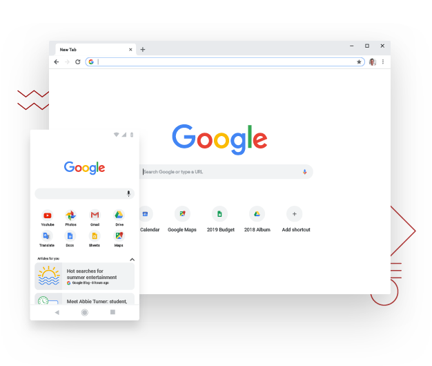
Current Google Chrome's NTP (Photo: Google)
Navigation depends a lot on the NTP. A horribly-designed NTP increases cognitive load and interaction costs. Today, after decades of evolving the browser, they've become easy to use and free of distraction. Still, I'm not completely satisfied. NTP are aesthetically pleasing, but other than that, why the huge amount of white space on the NTP?

